Content Blocks
Content Blocks
Our webpages are built by adding Content Blocks to Content Pages and Landing Pages. The different types of Content Blocks allow us to select the most appropriate way to organize and display our content. Each Content Block is designed for a specific purpose, type of content or amount of content.
**Humans naturally look for patterns as they navigate through a site. Consistency ensures their brains aren't forced to adapt to new patterns, which undermines their ability to absorb information. While there are multiple Content Block options, in most cases there should be no more than three different types of Content Blocks used on the same page or throughout a section.
Additionally, pages within a section of the site should use the same or nearly the same Content Blocks in the same or nearly the same order on the page. The pages within a section of the site should be relatively consistent with the pages throughout the entire site.**
CTA Strip
CTA [Call to Action] Strips are designed to appear directly underneath a hero image on a landing page and encourage users to take a specific action, like enroll in classes, register for an event, donate money, etc. They are not intended for anywhere else on a page or for any other use. A CTA Strip will appear automatically when you create a landing page. If you don't need, you can delete it.

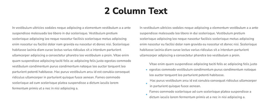
2 Column Text Content Block
The 2 Column Text Content Block is designed for about two paragraphs that can be easily displayed and read in two side-by-side columns.
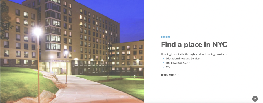
2 Column Layout Content Block
The 2 Column Layout Block is designed for a relatively small amount of text or list of links and an attractive related image. You can select on which side the image appears and the background color: white, grey, light blue or dark blue. You can include an optional link to another page at the bottom.
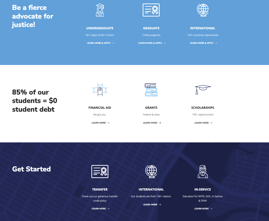
4 Column Layout Content Block
The 4 Column Layout Block is designed to display very high-level content with extremely brief text [about 60 characters] and an optional link to another page. Too much text will distort the block's layout on the page, especially on mobile, and limit users' ability to skim the content on the page easily.
A 4 Column Layout Block can be used with or without icons or with or without a background image. Do not combine icons with a background image.
Accordion Content Block
Accordion Blocks are designed for a list of information with relatively long explanations that would force readers to scroll down a long page. Accordions allow you to collapse information so that readers can skim to find only what they need.
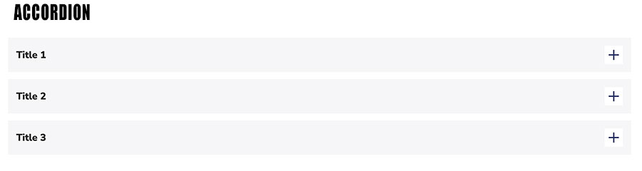
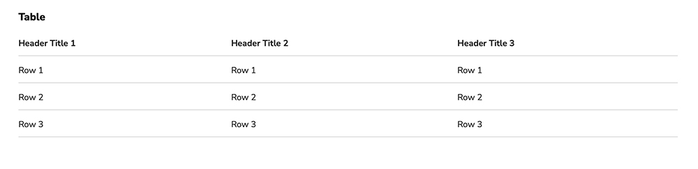
Table Content Block
Table Blocks allow you to organize content so users can access it at-a-glance.
Statistics Content Block
The Statistics Content Block is designed to use data to tell a story at-a-glance with an optional descriptive icon. The text underneath each data point should be very brief -- no more than 45 characters. You also have the option of including a link to another page.

Teaser Card Content Block
The Teaser Card Content Block is designed to share a lot of high-level information at-a-glance and include an image, brief subtitle, brief description and link to another page. You can select the background color: light blue, grey or white.
Stack Teaser Cards to surface a lot of important information in a relatively small space. See examples on the Undergraduate Programs and Graduate Programs Landing Pages.
To add a Teaser Block to your page, click Manage then Edit Content. Scroll to the bottom of the page and click Add block. Under Teaser blocks, select Teaser Cards. Type in the title of the block.
For the first teaser card, select an image from the media library, then type in the title of the card [teaser title]. The title should be no more than 15 characters.
If you're linking to a page on the John Jay site, scroll to Internal Link. Start typing the name of the page and the full page name should appear below. Click on it. If you're linking to a page not on the John Jay site, scroll to External Link and paste in the URL.
Under Teaser text, add a very brief (no more than 75 characters) description of the content on the page to which you're linking.
To add the next teaser card, click on Add Teaser Card and repeat the steps above. When you've added all four teaser cards, click Update. Check your work. If you don't have any changes, scroll to the top of the page and click Save Layout.